Your cart (0)
Your cart is empty
Tax included and shipping calculated at checkout

Drawer menu
Tax included and shipping calculated at checkout

If your room feels warm and welcoming until you look at the windows, choose linen curtain fabric with an undertone that connects to your walls, flooring and largest furniture pieces. Start with warm white, oatmeal or a muted earthy colour, then compare samples at the window in daylight and under your evening lighting. Check the fabric with its intended lining, because a sheer sample alone will not show the finished curtain’s colour or privacy.
Use the finishes you plan to keep as your starting point. A curtain does not need to match the wall exactly, but it should look intentional beside the floor, sofa and joinery.
For an appointment at home, prepare for a custom curtain consultation in Sydney with your paint details and any furniture samples you already have.
A warm interior can include cream walls, honey-coloured timber, terracotta tiles or a deep brown sofa. Adding another beige without checking its undertone can leave the room looking disconnected rather than coordinated.
Choose the relationship between colours before choosing the colour name. A fabric labelled natural, ivory or sand still needs to work beside your actual finishes. Treat the name as a starting point, not a reliable description of how it will look at home.
These are starting points for comparing samples, not rules that every warm room must follow. Use the table to narrow your choices before looking through fabric books.
| Colour direction | Best for | What it contributes | What to check |
|---|---|---|---|
| Warm white | A quiet window treatment beside pale walls | A soft connection between the window and wall | A creamy sample can look too yellow beside a cleaner white |
| Oatmeal or flax tones | Timber floors and layered neutral rooms | Gentle contrast without a strong colour statement | Some samples look grey or green beside warm finishes |
| Muted clay or blush | A room that needs a warm colour feature | A connection to earthy upholstery or accessories | The colour becomes more noticeable across a full curtain |
| Olive or earthy green | Rooms already using green in furnishings or artwork | A coloured alternative to beige | Compare carefully with timber and existing green tones |
| Deep brown or charcoal | A deliberately contrasting window | A stronger outline and more visual weight | Dark fabric changes the balance of a pale room |
Warm white is a useful first sample when you want the curtains to sit gently against pale walls. Compare it directly with the paint: a difference that seems tiny in a fabric book can become obvious when the curtain covers the window.
Avoid choosing the creamiest option simply because the room is warm. If your wall is a relatively clean white, a strongly yellow curtain can look mismatched.
Oatmeal and flax-like shades give you a middle ground between pale curtains and a pronounced colour feature. They are useful candidates when you want the fabric’s texture to be noticeable without making the window the centre of attention.
Their limitation is the range hidden within those names. Check several samples against your floor rather than assuming every natural-looking linen shares the same undertone.
Muted clay, blush or olive can connect curtains to a favourite rug, artwork or upholstered chair. Choose an existing colour you want to repeat, rather than introducing a new colour only at the window.
A small swatch understates the effect of a whole curtain. Before committing, ask to see as much fabric as possible held vertically.
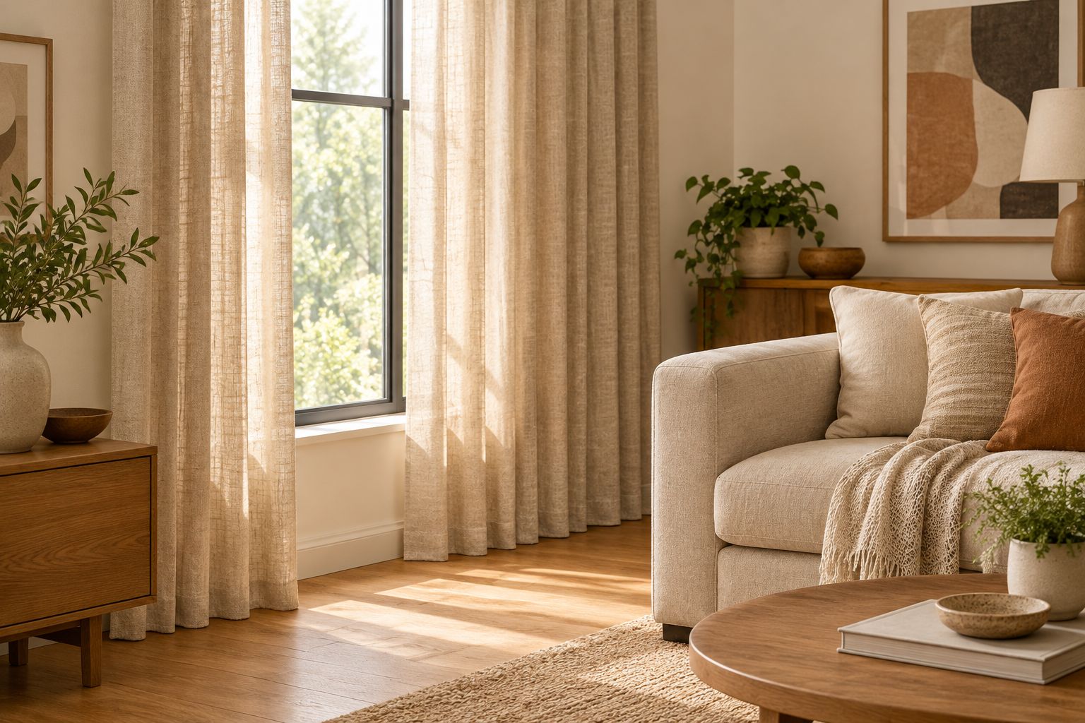
The fabric colour is only part of what you see. Check these factors before making your final selection:
Photographs are helpful for remembering combinations, but make the final decision with the physical sample. A phone screen is not a substitute for seeing the fabric at your window.
A warm colour does not make a curtain blockout. If your bedroom needs darkness, or your living room needs privacy after sunset, make those requirements part of the fabric discussion from the beginning.
Sheers soften the view and filter light, but they are not a dependable solution for night-time privacy when the room is lit. Consider a separate privacy layer, such as a suitable blind or lined curtain, rather than expecting the sheer to do everything.
For linen options, compare composition as well as colour. Paradiso Linen Sheer is described as a linen-polyester blend, while Emporio Linen is described as 100% linen; neither description alone establishes blockout performance, care requirements or suitability for your window.
These fabrics are useful starting points for a sample discussion. Confirm the current colour choices and care instructions before selecting either for custom curtains.
Linen curtains do not need to match the wall exactly. Choose a close tonal relationship for a quiet backdrop, or a clear difference when you want the window to stand out.
Avoid settling on an almost-match without checking it vertically. Decide whether the difference looks deliberate in both daylight and evening light.
Linen sheers can work with existing roller blinds when the layers have enough clearance and their colours sit comfortably together. Check the blind both open and closed before choosing the sheer.
Keep a blind that already meets your blockout needs in the conversation. The curtain can then address softness and style without being asked to replace that function.
Material World is best for homeowners seeking custom-made curtains and in-home fabric advice in Sydney and Orange. Its large premium fabric selection and more than 25 years of experience support a consultation that starts with your room rather than a fabric colour in isolation.
An in-home consultation lets you compare samples beside your own finishes and discuss privacy, blockout, fit and the finished look together. Material World’s curtains are genuinely custom-made, rather than factory mass-produced; the trade-off is that you need to approve the fabric and making details, not simply choose a ready-made panel.
Use the appointment to bring the showroom to you. Explain what is not working now, whether that is a stark-looking window, an awkward fit or insufficient privacy, so the recommendation is tailored to your home.
What's the best linen curtain fabric colour for a warm room?
The best starting colour is one that shares a compatible undertone with your walls and flooring. Compare warm white, oatmeal and muted earthy samples at the window before choosing.
Will white linen curtains look too stark with cream walls?
A clean white linen curtain can look stark beside cream walls. Compare a warmer white sample directly against the paint, then check that it does not look too yellow.
Should my linen curtains match my sofa?
Your linen curtains do not need to match your sofa. Use the sofa as a reference alongside your walls and floor, and decide whether the curtains should blend in or provide contrast.
Can I choose linen curtain fabric from an online photo?
Use an online photo to shortlist linen curtain fabric, not to approve its final colour. Check a physical sample in your room with the proposed lining and evening lighting.
Do linen sheer curtains give privacy at night?
Linen sheer curtains are not a dependable night-time privacy layer when your interior is lit. Discuss a separate blind or lined curtain if privacy after sunset matters.
Is pure linen better than a linen blend for curtains?
Pure linen is not automatically better than a linen blend for every curtain. Compare the actual fabric's appearance, care instructions and suitability for the heading and finish you want.
Do not approve linen from a sample stretched flat against the glass. Gather it into loose folds and place the intended lining behind it: that gives you a more useful view of the finished combination.
To make the choice in your own room, ask Material World to bring the showroom to you with a free in-home measure and quote in Sydney or Orange.


